Boards
What are Boards?
The Boards page is where you can unleash your data storytelling powers. On the Boards page, you can curate a collection of charts that not only contextualize your data but also weave a compelling story around it. Whether you're tracking product performance, customer satisfaction scores, or patterns across a particular Feedback Group, Boards empower you to create a visual tapestry that brings your insights to life.
Use Boards to:
- Organize related charts into a cohesive dashboard
- Build a narrative around key data trends and patterns
- Dive deeper into insights with detailed breakdowns to reveal underlying trends
- Share your data story with team members or stakeholders
Each board is composed of a series of Charts. Charts provide a flexible framework to plot your feedback data, apply filters, and segment it to gain deeper insights.
For each Chart, you can configure:
- Plot Unit: Decide if you want to A) plot the absolute volume of your time series, B) the percent share of feedback that that time series makes up, or C) the positive sentiment rate.
- Filters: Next, you can optionally filter to what you want to include in the chart. For example, you can filter to all feedback from a specific Group of feedback or by a custom field.
- Breakdown: You can optionally break your plot down by your choice of critiera (e.g., source, segment, sentiment, group, etc.). For example, you could plot the positive sentiment rate of feebdack, broken down by source (iOS vs. Android)
Examples of Charts
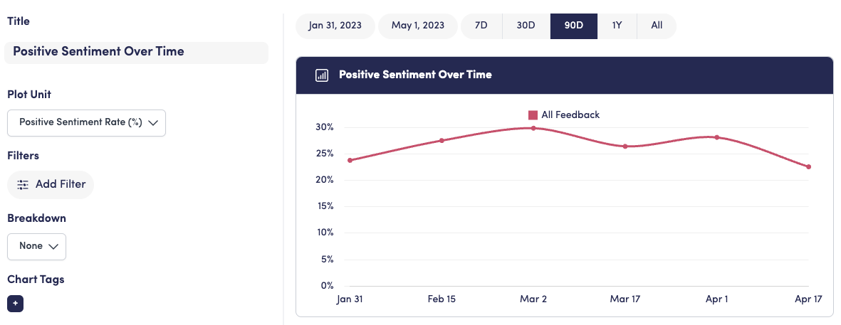
Overall Positive Sentiment Rate
To get the postive sentiment rate across all feedback in your View, select the Positive Sentiment Rate to plot. Since you want to calculate this across all feedback, don't add any filters.

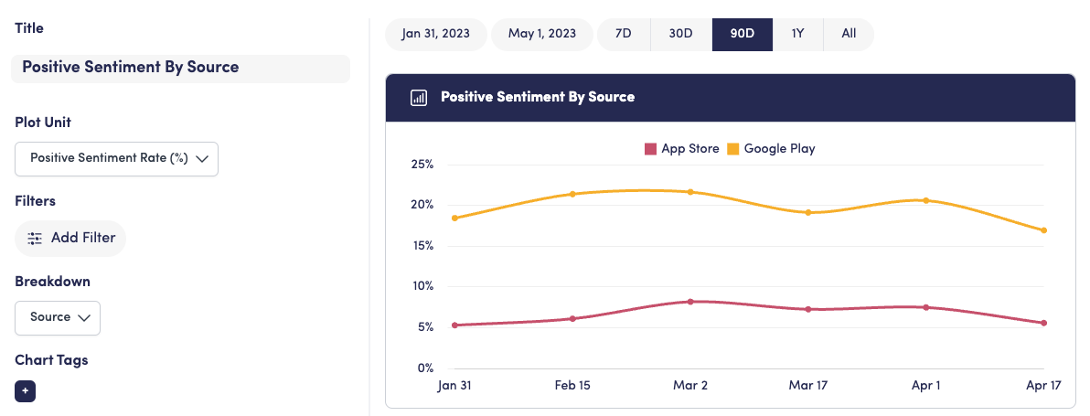
Positive Sentiment Rate by Source
If you wanted to see how that positive sentiment trends split by feedback from the App Store vs. Google Play, you can add the "Source" breakdown. In this case, Apple App Store feedback is meaningfully less positive than Android.

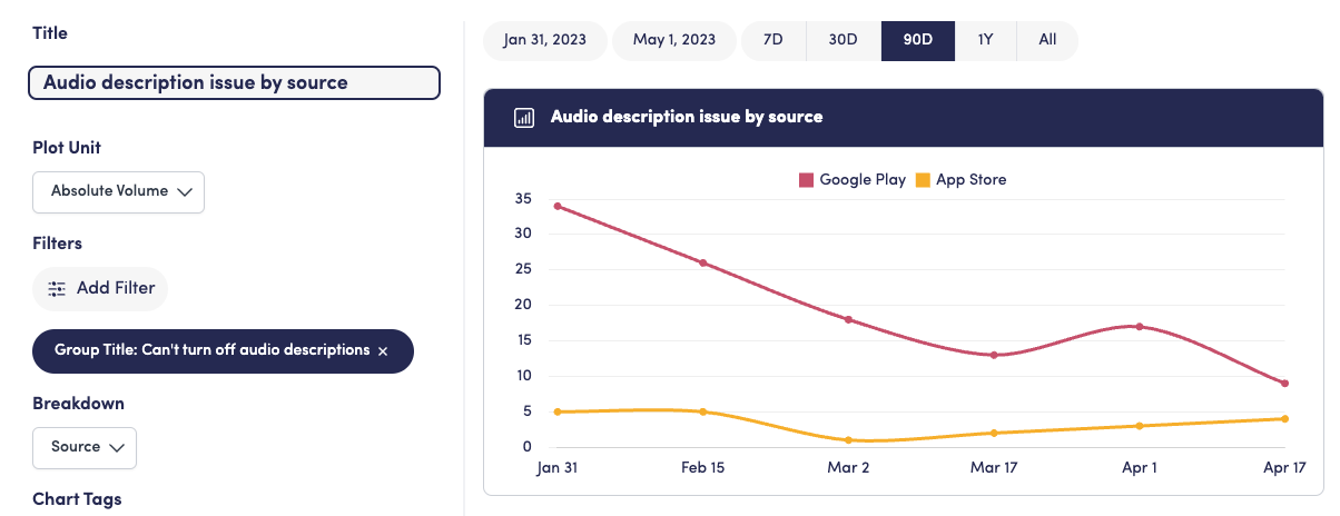
Volume of an issue by Source
Finally, if you wanted to see which source/platform was driving the most complaints for a specific issue (e.g., "Can't turn off audio descriptions"), you could filter to feedback from the "Can't turn off audio descriptions" group, plot the absolute volume, and break down the chart by source.
