Charts
The Charts page is where you can investigate time series trends at whatever granularity suits your needs. For example, if you wanted plot the Positive Sentiment Rate of feedback about "payments", or look at what percent of your feedback comes from the Apple App Store vs. Google Play, Charts allows you to answer that.
For each Chart, you will configure:
- Plot Unit: Decide if you want to A) plot the absolute volume of your time series, B) the percent share of feedback that that time series makes up, or C) the positive sentiment rate.
- Filters: Next, you can optionally filter to what you want to count. For example, you can filter to all feedback from a specific Group of feedback.
- Breakdown: You can optionally break your plot down by your choice of critiera (e.g., source, segment, sentiment, group, etc.). For example, you could plot the positive sentiment rate of feebdack, broken down by source (iOS vs. Android)
Charts can be saved, tagged for organization and filtering, and shared, just like Groups.
Examples
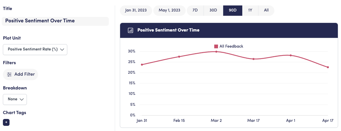
Overall Positive Sentiment Rate
To get the postive sentiment rate across all feedback in your View, select the Positive Sentiment Rate to plot. Since you want to calculate this across all feedback, don't add any filters.
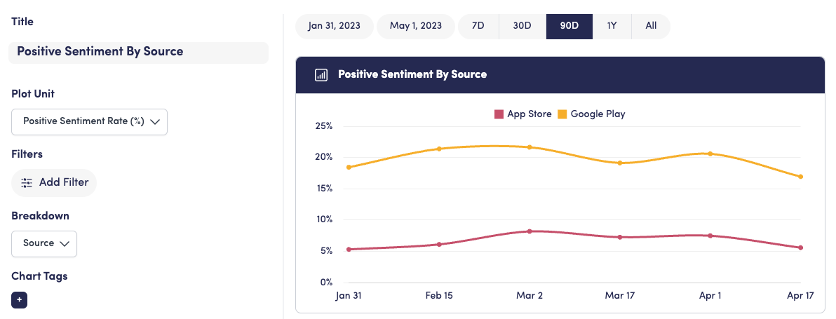
Positive Sentiment Rate by Source
If you wanted to see how that positive sentiment trends split by feedback from the App Store vs. Google Play, you can add the "Source" breakdown. In this case, Apple App Store feedback is meaningfully less positive than Android.
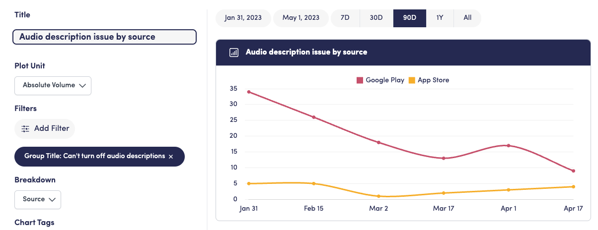
Volume of an issue by Source
Finally, if you wanted to see which source/platform was driving the most complaints for a specific issue (e.g., "Can't turn off audio descriptions"), you could filter to feedback from the "Can't turn off audio descriptions" group, plot the absolute volume, and break down the chart by source.