Usage
Last updated: July 24, 2026
Usage Reporting gives organization admins insight into how their team is actually using Unwrap — active users, engagement trends, and Assistant adoption across every surface, on demand.
Who this is for: Organization Admins
Overview
Reporting gives org admins a clear view of how their team is using Unwrap. In one admin-only page, you can see active users, engagement over time, and Assistant adoption across the web app, API, MCP, and Slack — plus which Groups and Boards your team uses most — all scoped to your own organization and available on demand. It's the fastest way to understand where adoption is strong and where there's room to grow.
Reporting measures adoption and usage — who on your team is using Unwrap, how much, and what they're engaging with. It is not feedback analysis. For insights about your customers' feedback, use the Home, Explore, and Assistant pages instead.
Prerequisites
Organization Admin role. Reporting is available only to users whose role in the currently selected organization is Admin (not Member). This is the org-level role, separate from per-View roles like Contributor, Viewer, and Replier, which have no bearing here. Admin status follows your active org — if you're an admin in one org and a member in another, you'll see Reporting only while the admin org is selected. Members don't see the Reporting nav item, and navigating directly to the URL shows an "only available to organization admins" message.
No setup or minimum history. Reporting reads your org's existing usage data — nothing to switch on. A brand-new org with no activity still loads the full page: KPIs show zero and each section shows a "No activity in the selected date range" message until data starts flowing in.
How It Works
Reporting is a single, scrollable page. You set a date range at the top, and everything below recalculates for that window by querying live usage data — there's no nightly snapshot, so the numbers reflect activity within seconds of it happening. Activity is tracked across four surfaces — the web app, API, MCP, and Slack — and each person is counted once, matched by email, so the same person active in two places isn't counted twice.
Date ranges use your browser's timezone, counted from the start of the first day to the end of the last day. Because of that, a "30D" view from New York and from London can differ slightly at the day boundaries.
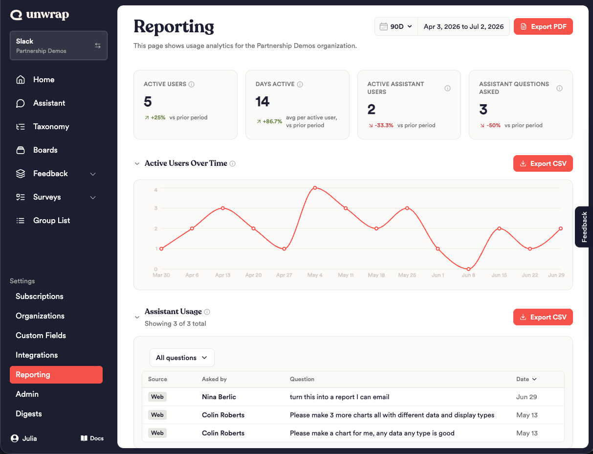
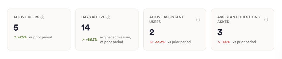
Understanding the KPI cards
Each card shows a value for the selected range and a trend arrow versus the immediately preceding window of equal length.
Active Users — Distinct people on your team with any tracked activity in the range. Each person is counted once, matched by email across the web app, API, MCP, and Slack — so someone active on both Slack and the web counts once, not twice. This is not a login count.
Days Active — The average number of days each active user was active in the range, counted from web or API activity (the in-app tooltip labels this "web app"). It's a per-user average, so a low number is normal and doesn't indicate low Assistant, MCP, or Slack usage.
Active Assistant Users — Distinct people who used the Assistant, counted once per person by email across web and Slack.
Assistant Questions Asked — The total number of questions your team asked the Assistant, including via Slack and scheduled reports.
Working with the sections
Active Users Over Time — A line chart of distinct active users across the range. It buckets daily for the 7D view and weekly for 30D, 90D, and 1Y, and switches to monthly x-axis labels on the longest ranges (roughly four months or more — in practice, the 1Y view). Hover any point to see its value. This section is read-and-interpret only — no filtering — and exports to CSV.
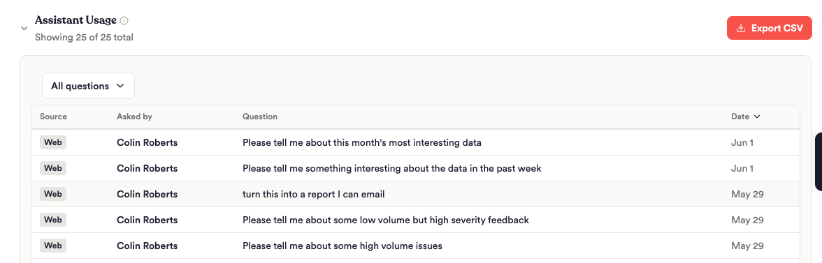
Assistant Usage — A log of the questions your team asked the Assistant, newest first. Columns are Source (Web, Slack, or Scheduled), Asked by (name, with email on hover), the Question text, and Date. Filter the log by source (All / Users / Slack / Scheduled), sort by the sortable columns, and click Load 100 more to page through longer logs — a subtitle shows "Showing X of Y total." The CSV export includes the full question text.
Group Engagement — A sortable table of your top 10 Groups by view count in the range (Group, Views), highest first. This is a leaderboard, not a full inventory — both the table and its CSV are limited to 10. Click a group name to open that Group in Explore in a new tab.
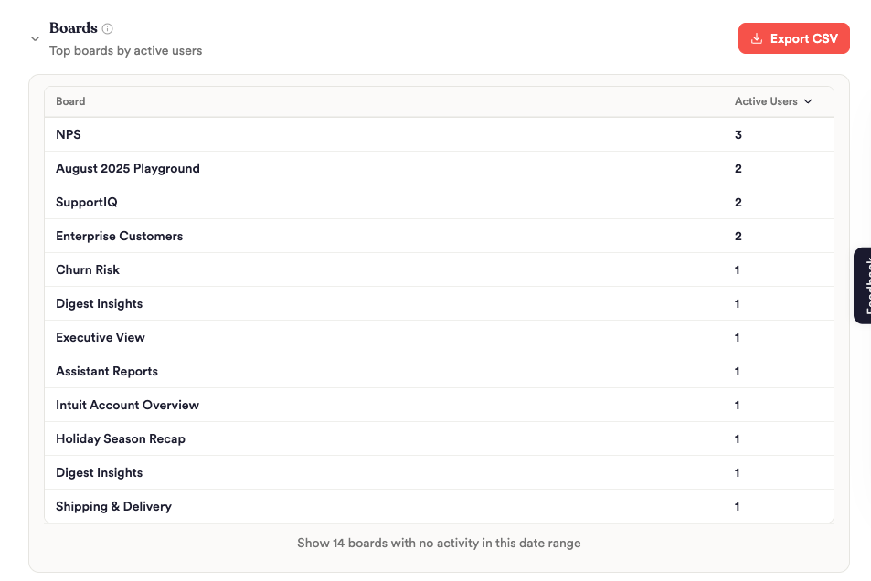
Boards — A sortable table of boards ranked by active users (Board, Active Users). Active boards appear first; boards with zero activity in the range are tucked behind Show boards with no activity toggle and flagged as cleanup candidates. Exports to CSV.
Users — Your full team roster. Search by name, email, or role, and sort on any column. Columns are Name, Email, Role (org-level Admin or Member), Last Active, Days Active, and Surfaces.
Configuration Options
Reporting has no saved settings — it's driven entirely by the controls on the page, which reset each session.
Control | What it controls | Default | Available values |
|---|---|---|---|
Date range | Scopes every KPI, chart, and table on the page | 30D | 7D, 30D, 90D, 1Y |
Section collapse | Show or hide an individual section | Expanded | Expanded / collapsed |
Assistant Usage source filter | Filters the question log by origin | All | All, Users, Slack, Scheduled |
Boards inactive toggle | Reveals boards with zero activity in the range | Hidden | Shown / hidden |
Users search | Filters the roster by name, email, or role | Empty (all shown) | Any text |
Export PDF | Downloads a shareable summary of the whole view | — | — |
Export CSV (per section) | Downloads that section's underlying data | — | — |
Best Practices
Match the range to the question. Use 7D or 30D to spot recent adoption changes, and 90D or 1Y to judge sustained trends. Because every metric compares against the immediately preceding window, the trend arrows are most meaningful when your range reflects a normal period of activity.
Read Active Users and Days Active together. Active Users tells you how many people showed up across all surfaces; Days Active tells you how often the web/API users came back. Rising users with flat Days Active can signal onboarding that hasn't turned into a habit yet.
Use Boards cleanup candidates to tidy up. The "no activity" toggle surfaces published boards nobody is using — a quick way to prune clutter for your team.
Export PDF for stakeholders, CSV for analysis. The PDF is a formatted summary built to share; the per-section CSVs give you the raw rows for your own pivots and joins.
Confirm you're in the right org. Since admin access and all data follow your active organization, switch to the correct org before reading or exporting.
Limitations
Very large orgs (2,000+ members). The Users table and its CSV export show up to 2,000 members. If your organization has more, the additional members aren't listed or exported — the KPIs and other sections are unaffected.
Group Engagement is top 10 only. Both the table and its CSV show only the top 10 Groups by views — by design, not the full list.
Export PDF is a summary, not the full dataset. It includes the KPIs, the trend chart, top Groups, top Boards, and your top 10 active users, with links back to Reporting for the complete lists. It intentionally omits the Assistant question log.
View-only — no scheduled or emailed reporting. You can export on demand, but nothing arrives automatically; open the page to see current data. (Scheduled/emailed digests were scoped but did not ship in this release.)
Timezone-sensitive boundaries. Ranges use your browser's timezone, so day-boundary activity can shift counts slightly between viewers in different zones.
Data freshness. Reporting queries live data on every load — there's no batch or overnight delay. Usage events stream in continuously and typically appear within seconds; reload the page to pull the latest. (Very brief additional lag is possible under heavy load.)
FAQ
Q: Why don't these numbers match my feedback dashboard? A: Reporting measures usage and adoption — who on your team is using Unwrap and how much. It's not feedback or insights analysis, so it won't line up with Group counts, sentiment, or volume on your feedback pages. They answer different questions.
Q: Why is my Days Active number so low? A: Days Active is a per-user average of days with web or API activity (labeled "web app" in the tooltip). It doesn't count Assistant, MCP, or Slack days, so a heavy Slack-based team can show a low Days Active while still being highly engaged.
Q: A teammate is clearly active but isn't showing up. Why? A: Two common causes: (1) their activity is under a different email, so it isn't attached to their listed account (each person is matched by email); or (2) their activity sits just outside your selected range at a day boundary in your local timezone. Widening the range or checking the email on file usually explains it.
Q: Does API usage count? A: Yes. Active Users counts activity across Web, API, MCP, and Slack, and the Users table shows an API pill for it. (Some in-app tooltips list only web, MCP, and Slack, but API is included.)
Q: Only my top 10 Groups show in Group Engagement — where are the rest? A: Group Engagement is a top-10 leaderboard by views, in both the table and the CSV. It's meant to surface your most-viewed Groups, not to be a full inventory.
Q: Can I schedule Reporting to arrive by email? A: Not in this release. Reporting is view-only per session — you can Export PDF or Export CSV on demand, but nothing is sent automatically. Open the page whenever you want current data.
Q: Can I give my whole team access, even read-only? A: No. Reporting is available only to organization admins in this release — there's no member or team-lead view. Members won't see it in the nav and can't reach it by URL.
Q: Why does my board count look higher than the boards we actually use? A: Boards lists every published board, then flags the ones with no activity in your selected date range behind the "show inactive" toggle as cleanup candidates. A board can be quiet in a 7D window but active over 90D — so widen the range before treating one as unused. The total reflects all published boards, not just currently active ones.